Softube: Seven years of graphic design and coordination
About
Softube is a Swedish music technology company with a global customer base, selling software, hardware and subscription music production tools. I joined as their in-house graphic designer in 2018 and worked there for 7 years with design and project coordination, through over 70 product launches and hundreds of sales and marketing campaigns.
My role
My work covered the full production pipeline: developing visual identities for product launches, adapting them across every channel, coordinating campaigns as project leader, and keeping the brand consistent across everything from newsletters and social posts to packaging and trade show stands. I was often running the design and the coordination on the same project simultaneously.
Campaign design
Brand system
Product launch design
Email marketing
Project coordination
Social media
Web design
Packaging & print
Working within the brand
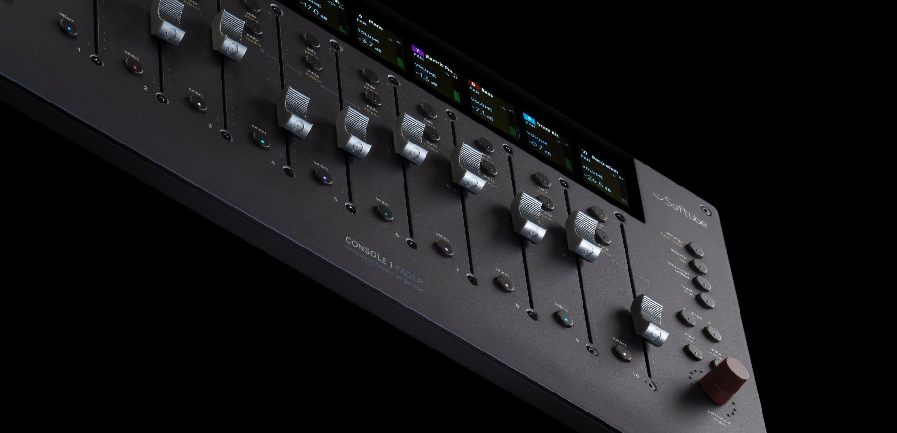
Softube has a strong visual identity with dark tones, product-led imagery, precise use of green, and a premium feel built around the products themselves.
My job was to keep that system intact across a continuous stream of output. This meant applying the same visual logic to very different products, formats, and audiences.

Campaign production and coordination at scale
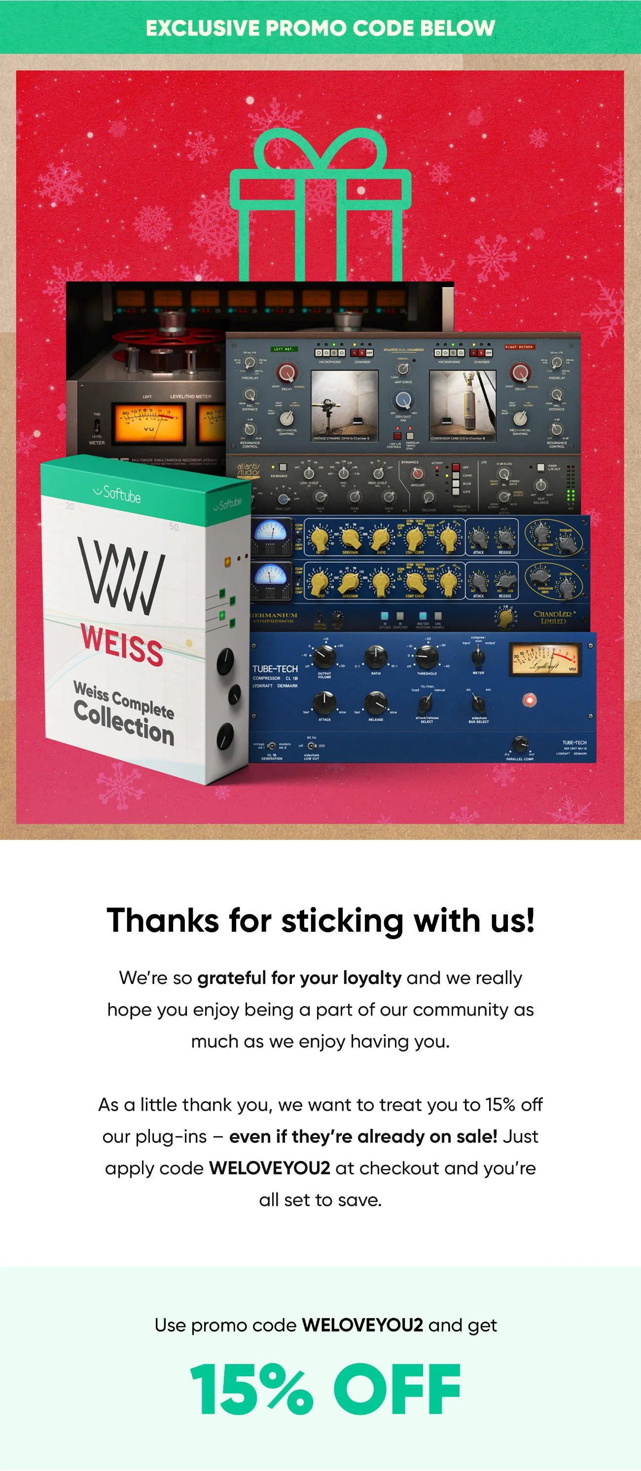
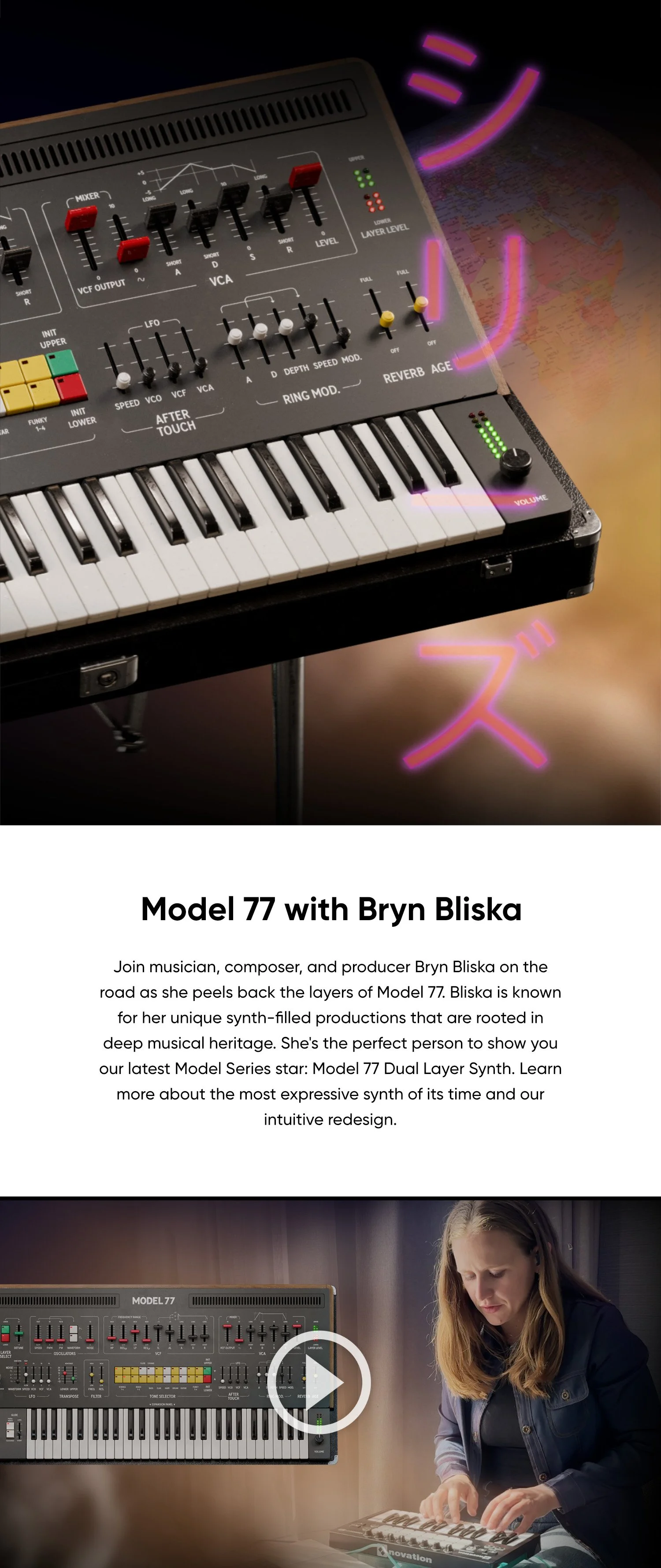
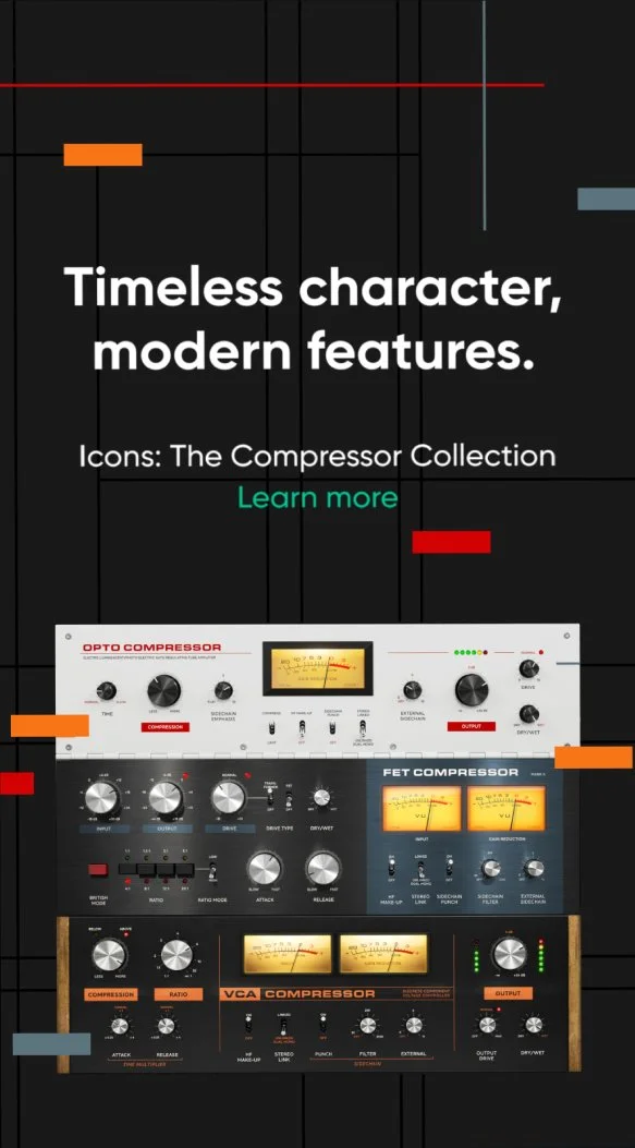
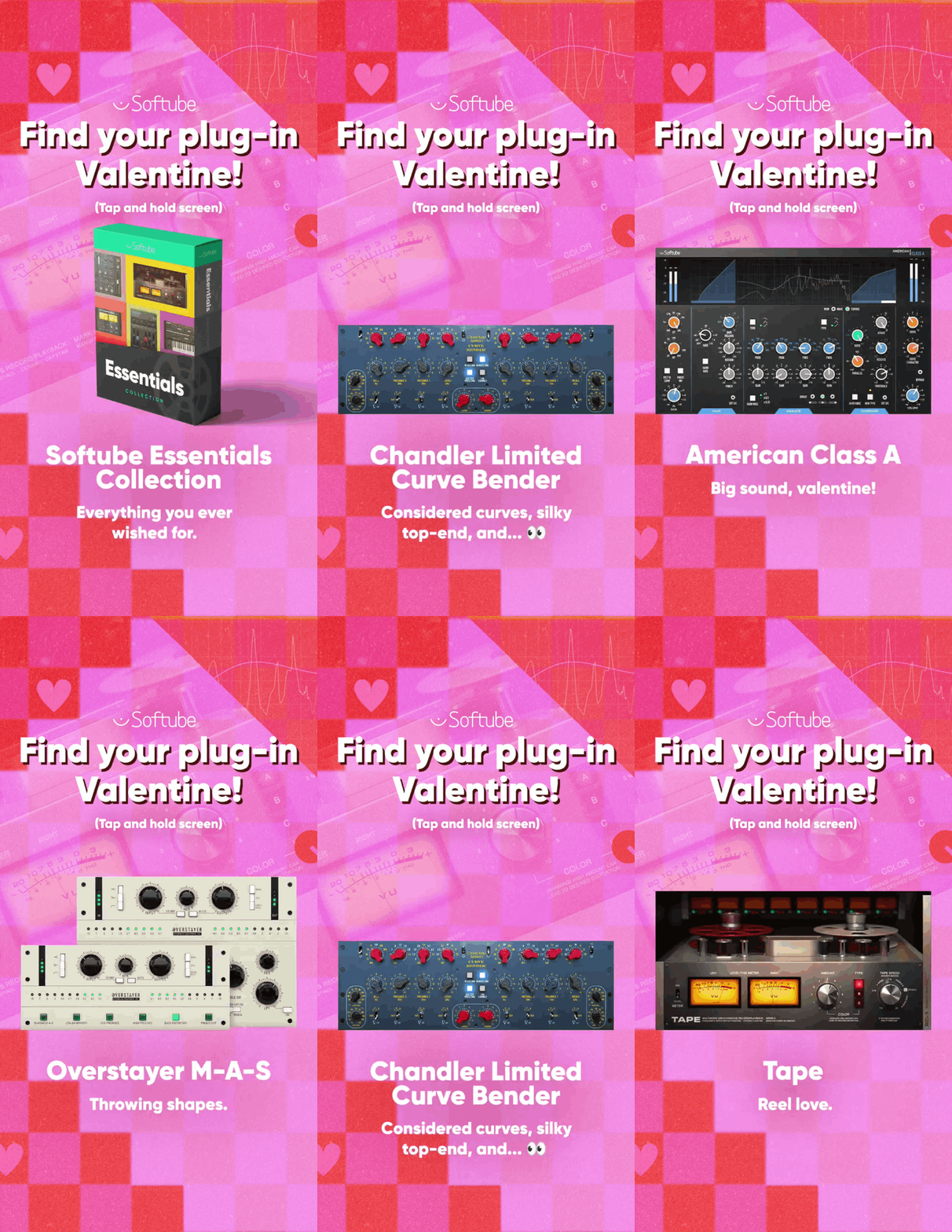
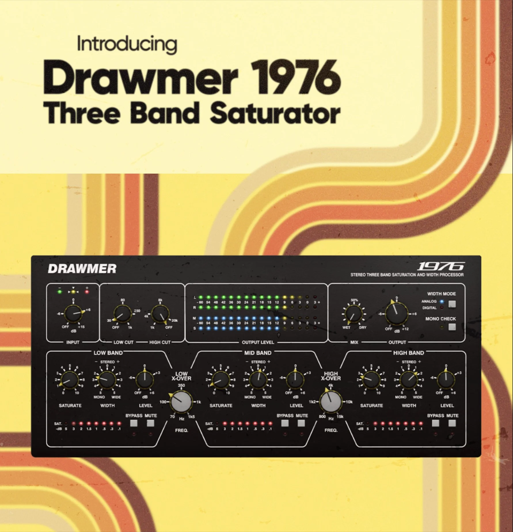
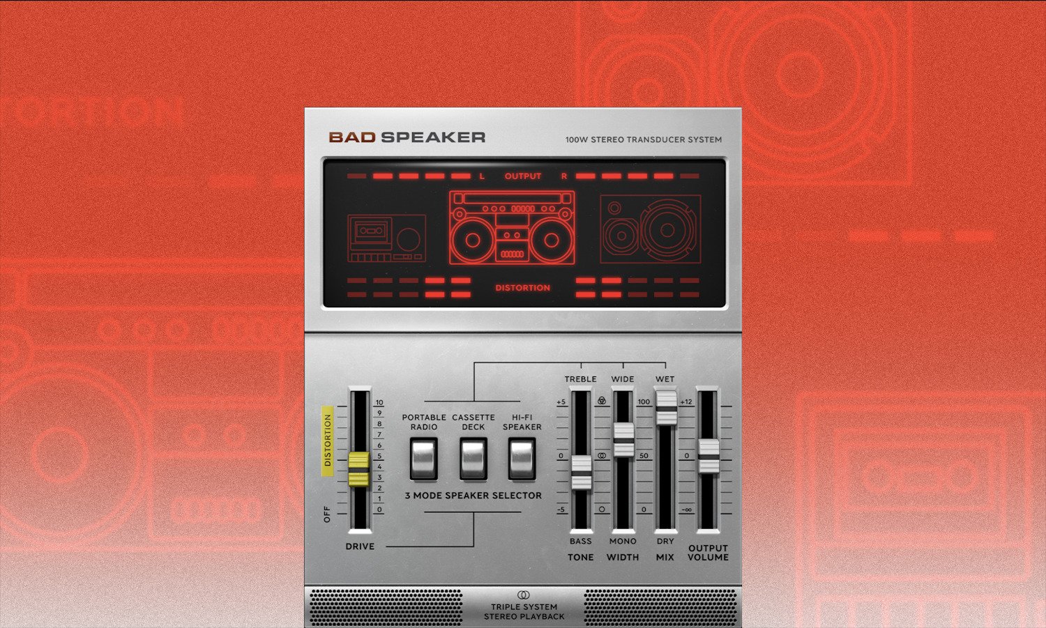
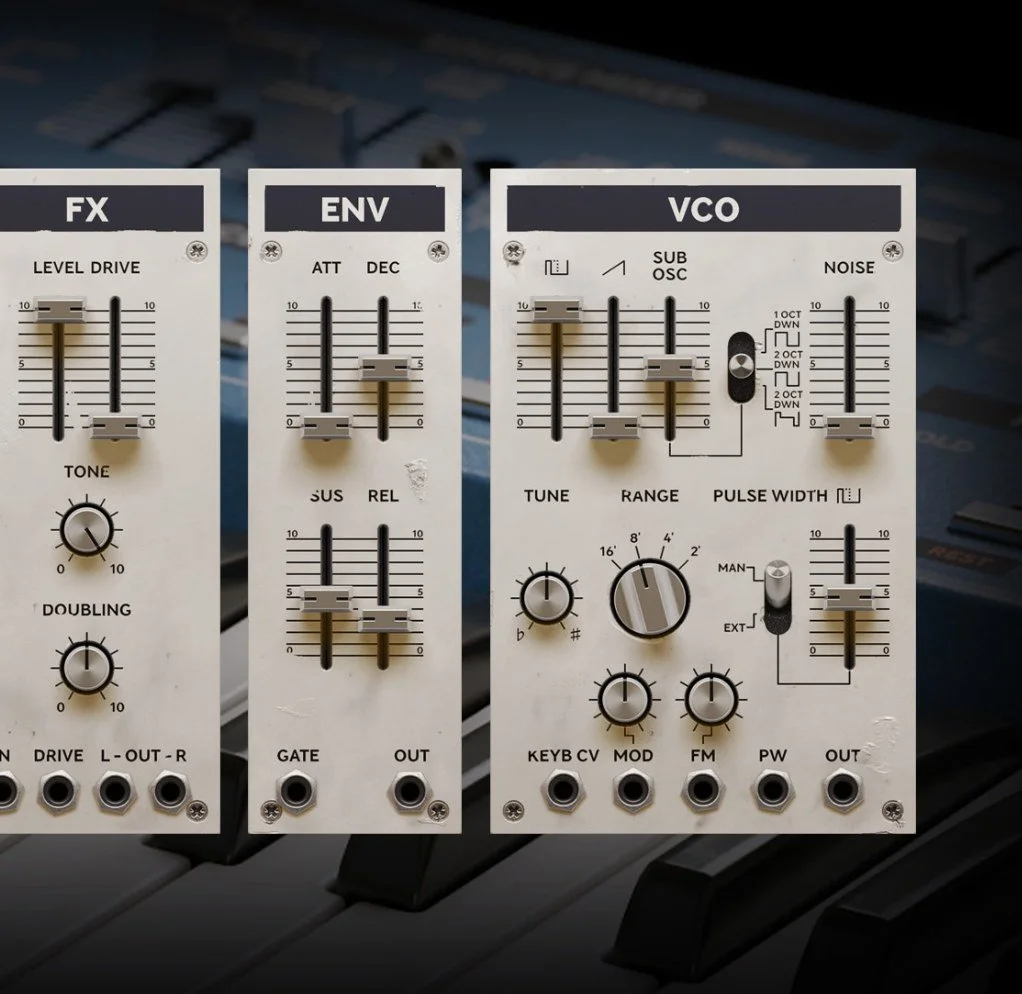
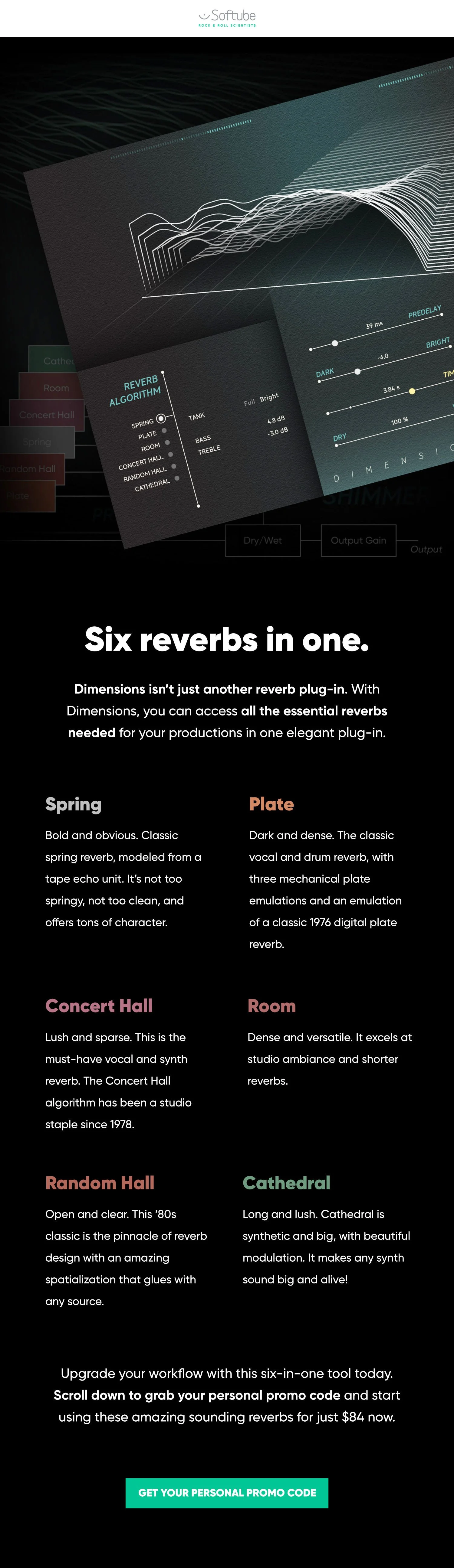
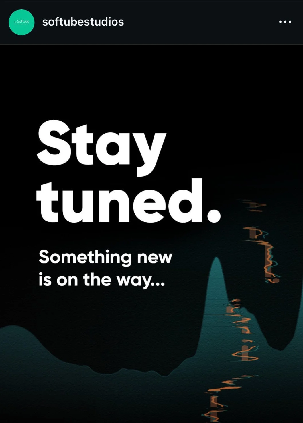
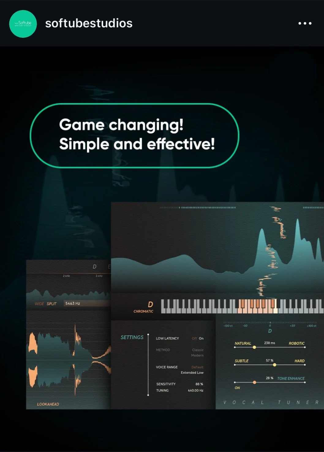
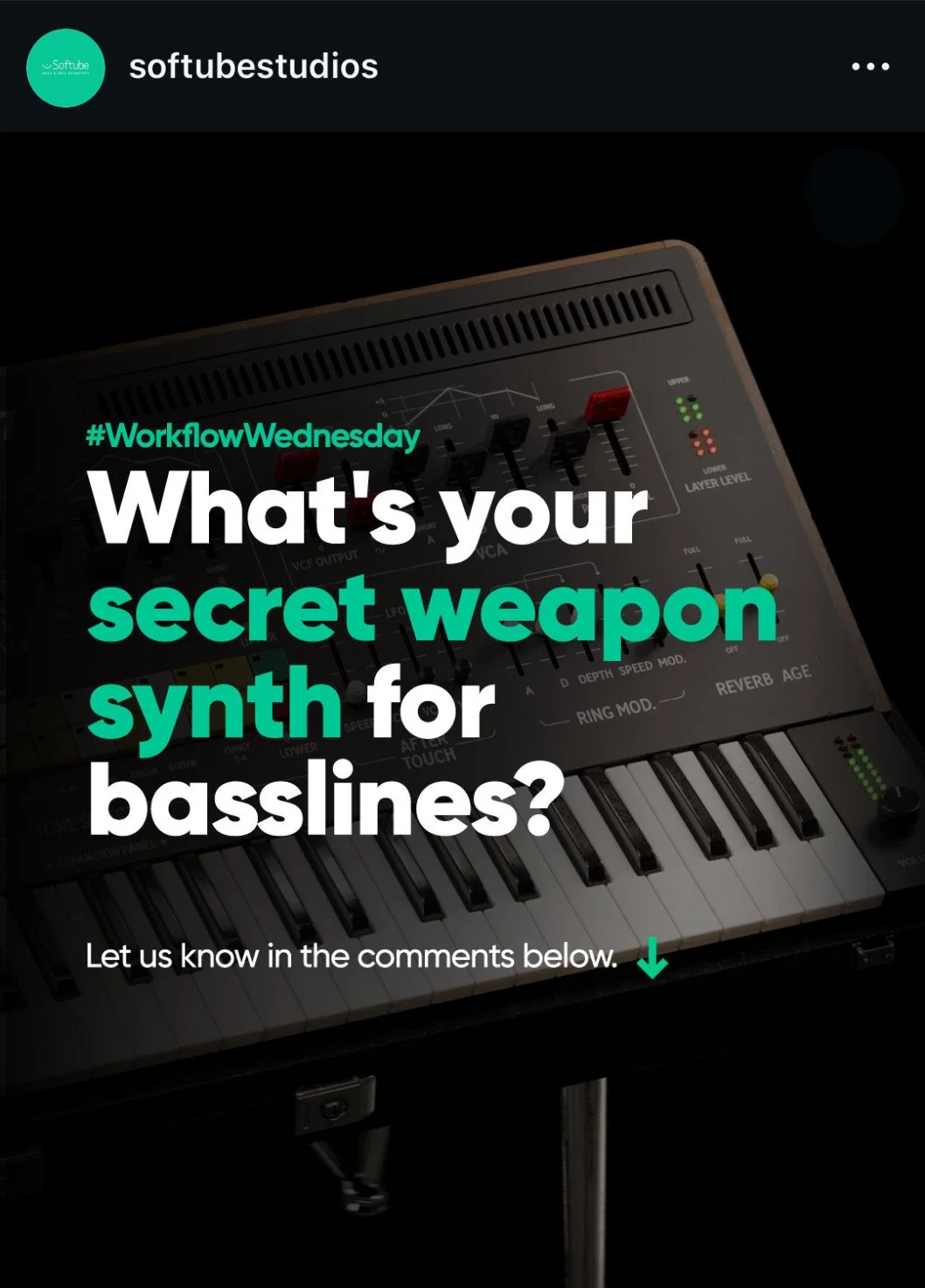
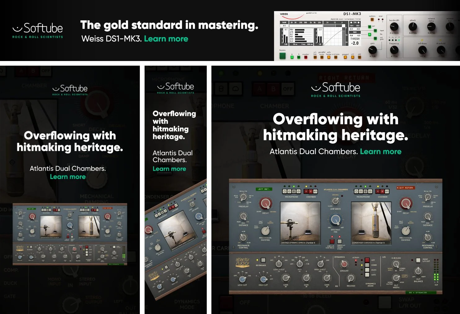
These assets span different products, campaigns, and formats; newsletters, product pages, social content, and ads, produced as part of a continuous output where at least one launch and one sales campaign were always running simultaneously. Each product got its own campaign identity, but everything had to feel like the same brand.



When the campaign needed its own identity
Some products called for something more distinct, a separate visual identity that gave the launch its own personality while still working within the Softube brand. The layout structure, typographic system, and ad format stayed consistent, but the color palette, mood, and visual references could shift significantly from the core brand.


Visual direction
Since the hardware synth was popular in the 90s rave and techno culture, it was important that the campaign reflected this.
I explored references from posters, magazines, and rave photography to create a direction that felt bold, nostalgic, and messy, while still fitting Softube’s brand.
The identity was adapted across all launch channels; social, email, website, and ads.

References from 90s rave culture and poster design.
Campaign color palette.
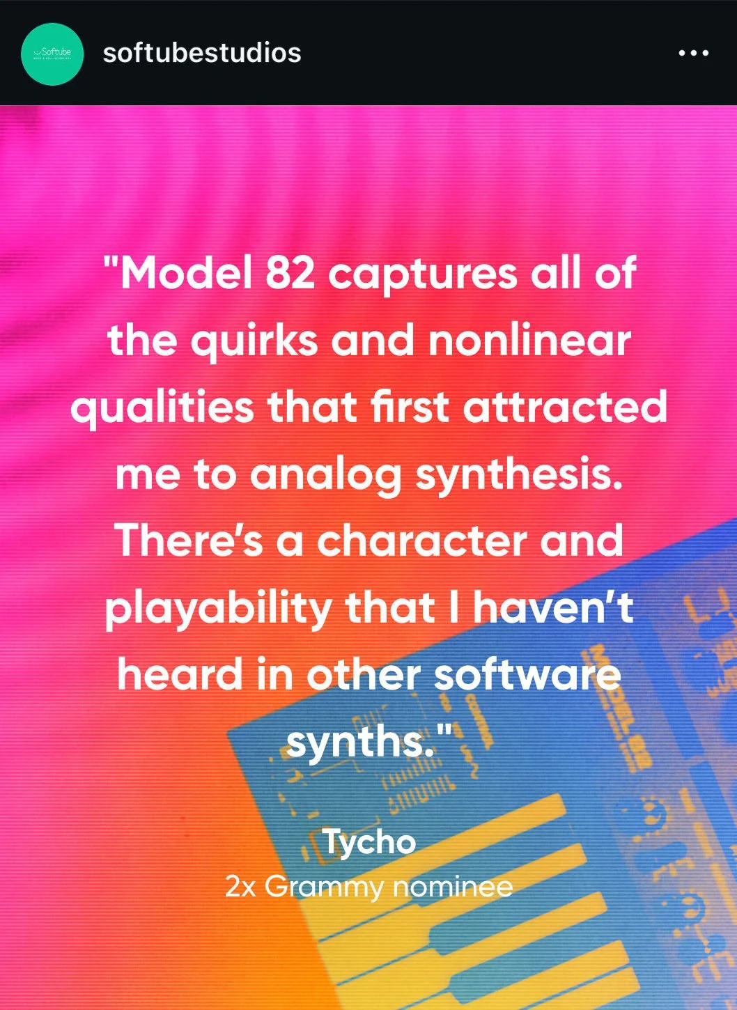
The identity was developed in two color directions, a primary yellow/green version and a secondary pink. This gave the campaign flexibility across different formats.




Packaging, print, and art direction
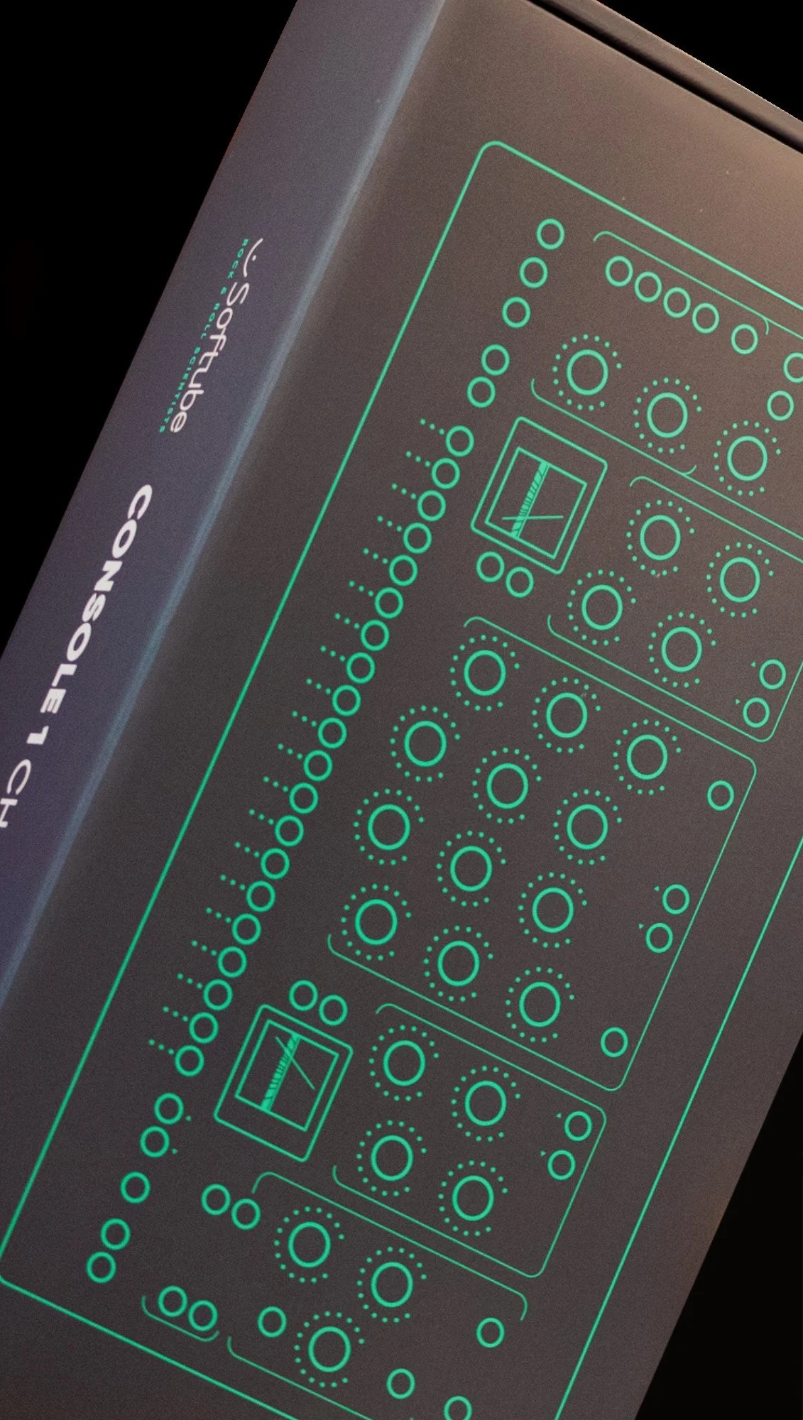
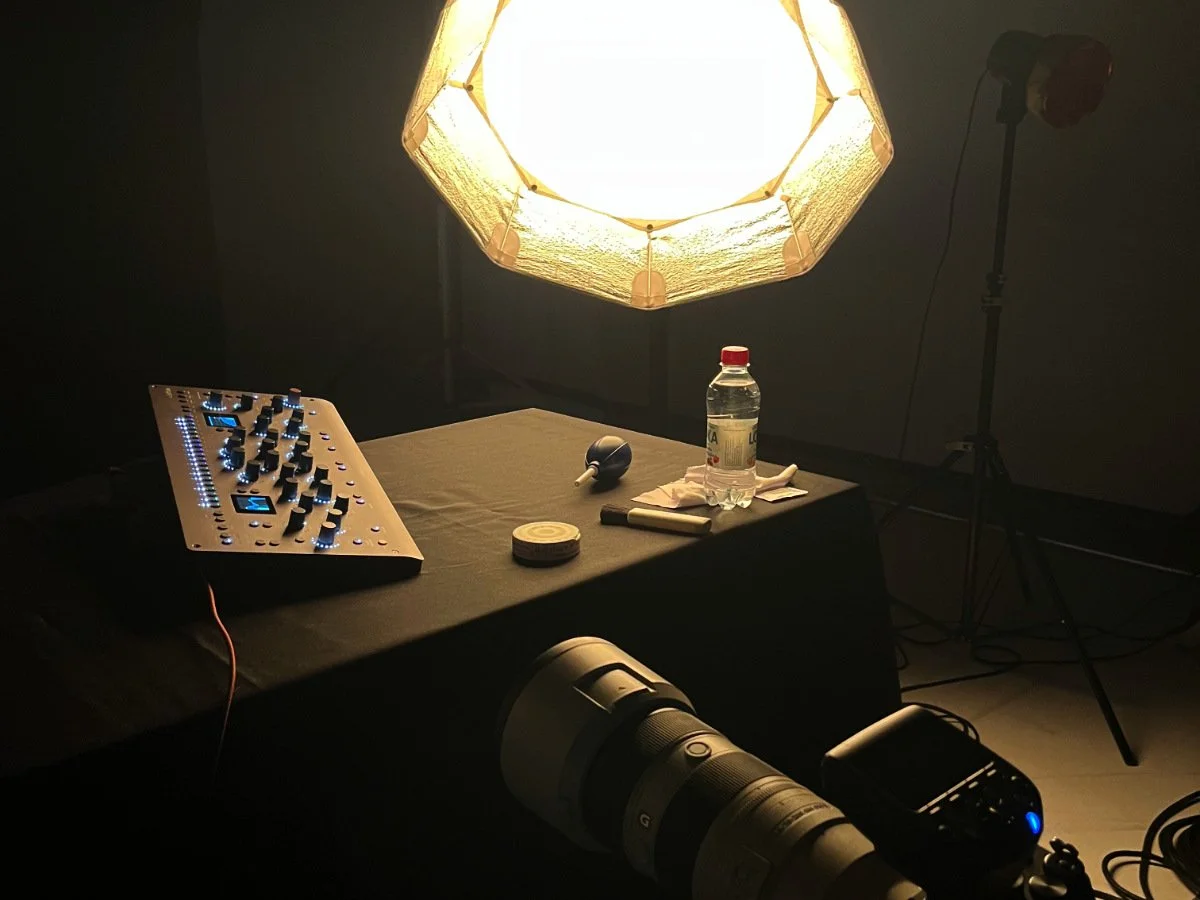
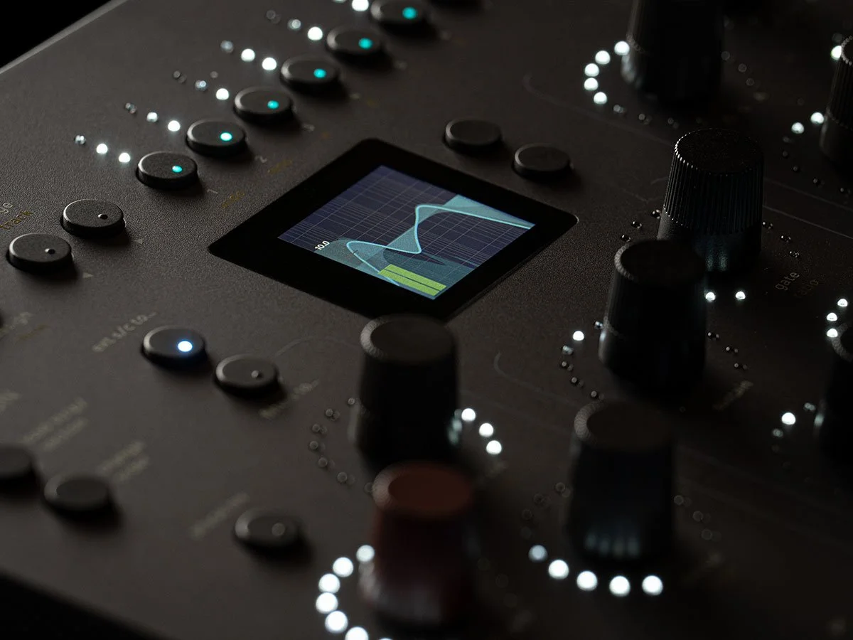
The same visual standards applied to physical touchpoints; product packaging developed together with the hardware team, trade show material, and product photography art directed with an external production company.


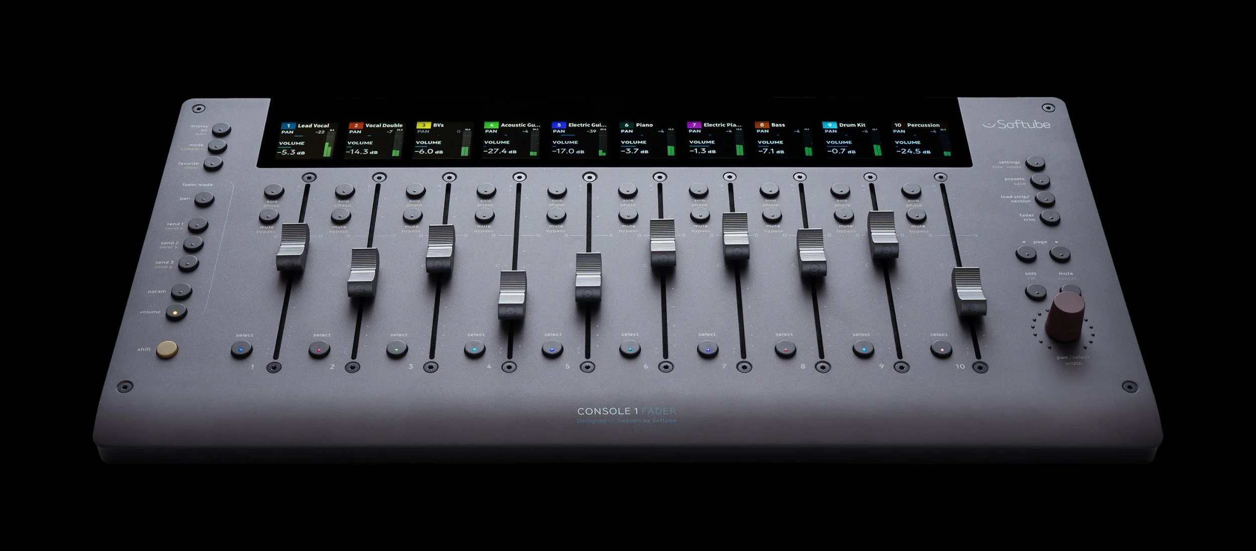

Campaign highlights across launches and promotions